In an era where data is wealth, how businesses interpret and analyze data plays a pivotal role in their success. Harvesting business insights from data calls for effective interpretation techniques, and bubble charts are sophisticated analytical tools. As valuable as they are, only some businesses are aware of their potential or use them optimally. Keep reading to discover more about the benefits of bubble charts for business.
Understanding Bubble Charts
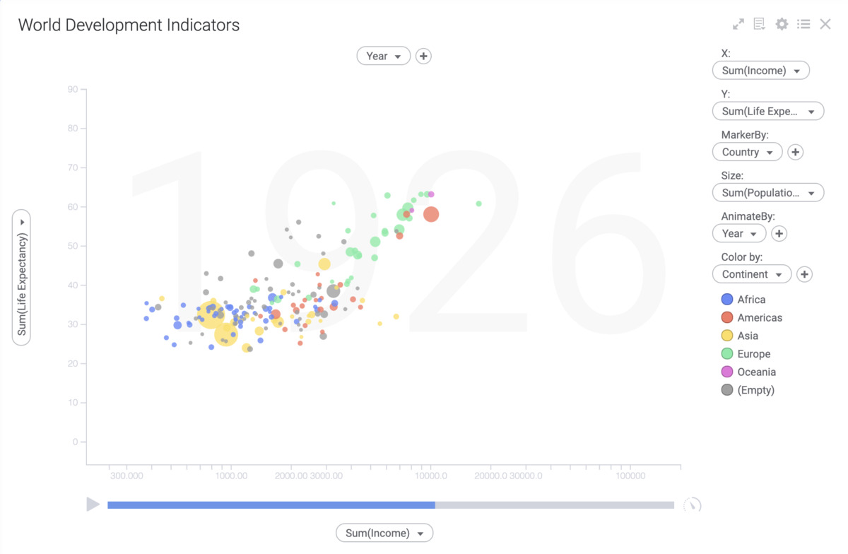
Bubble charts are three-dimensional graphs that effectively display multiple variables of data simultaneously. Each bubble represents a data point, with its size signifying the frequency or magnitude of that data point. The chart’s X and Y axes represent other variables of interest, thus making the visualization comprehensive and insightful.
They are used to display three sets of information or variables at once. Each bubble’s size is determined by one variable, while the bubble’s placement on the chart corresponds to the two other variables. Hence, it allows for an easy comparison of data trends over periods.
Bubble charts play a prominent role in business analysis for multiple reasons. They offer an easily discernible visual aid for communicating relationships between multivariate data. By creating a visualization, businesses can better identify trends and correlations.
They are instrumental when working with a high volume of big data. Bubble charts provide a sophisticated yet simple visualization that allows companies to draw meaningful interpretations from data, aiding decision-making processes.
Decoding Business Insights from Bubble Charts

Bubble charts offer unique insights by revealing correlations and trends across multiple data sets that might not be visible in traditional charts and graphs. Recognizing the bubbles’ size, position, and color can lead to a deeper understanding of the data, exposing trends and patterns that might otherwise go unnoticed.
The ability to illustrate three or four distinct variables simultaneously aids in streamlining data-informed decision-making processes. By identifying relationships and patterns between variables, businesses can make informed decisions, forecast market trends, evaluate performance, and strategize plans more effectively.
Bubble charts can expose obscure yet substantial insights. For example, a company using a bubble chart to analyze sales across different regions can identify the most profitable areas by looking at the size of the bubbles. The positioning of the bubbles can signify how regional sales have changed over time or how they compare with other factors, such as customer demographics.
Real-World Examples of Effective Bubble Charts Usage
Bubble charts are used extensively in varying fields due to their versatile nature. One prominent example is in financial stock market analysis. Here, bubble charts can illustrate three dimensions, company size, sector, and stock growth rate, all at once, enabling investors to make informed decisions swiftly.
In sports, these charts help visualize player performance stats, comparing various factors such as goals scored, assists, games played, etc. This helps in crafting team strategies and analyzing player performances.
In the geopolitical arena, bubble charts illustrate economic factors such as GDP, population, and per capita income across nations, thus depicting global economic trends comprehensively. They also aid in understanding social issues, comparing parameters such as healthcare accessibility, literacy rate, and income disparity.
As such, using bubble charts spans multiple domains for distilling intricate and complex data into visually appealing and easily understandable graphs.
Advanced Tips for Leveraging Bubble Charts Effectively
Going beyond basics, one can optimally leverage bubble charts through strategic techniques. Including an additional variable through color coding can transform a three-dimensional bubble chart into a four-dimensional one. This advanced technique aids in deeper data segmentation and delivers a more sophisticated data visualization.
Using a logarithmic scale for the bubble size can streamline data representation with wide-ranging values. The bubbles’ sizes become proportionate to the logarithm of the variable, depicting data variances more clearly.
Animating a bubble chart over time provides a visual narrative of data changes over a designated period. This dynamic display of temporal data makes trends and patterns more discernible and thus strengthens strategic decision-making.
Additionally, interactive bubble charts, where one can click or hover over the bubbles to reveal granular data details, can make the chart more intuitively accessible. Strategizing such advanced techniques equips businesses with an enhanced tool for robust data analysis.
Altogether, bubble charts serve as sophisticated analytical tools that offer critical insights and contribute substantially to informed business decision-making. With a clear comprehension of their structure, functionalities, and applicable strategies, businesses can maximize their potential and outwit the complexities of data analysis.
Read also: Seven Tips For Effectively Sharing Your Company’s Marketing Plan